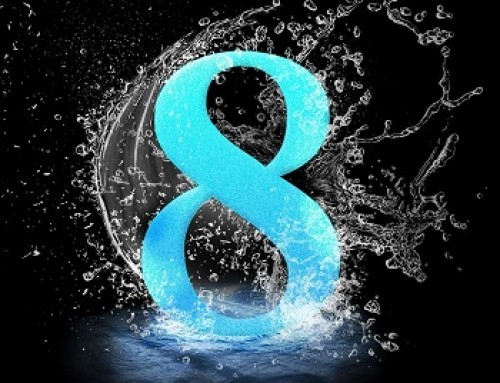
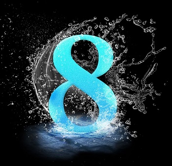
An associate is in the process of selecting a new logo and colors for a new business venture. We got a sneak peak last week of the grayscale version of six and then two more in color. My associate personally likes to review the tests in grayscale so that the color doesn’t influence her choice.
[title size=”2″]Yvonne’s Tip: Color vs Grayscale vs Black & White Logo[/title]
I like to look at both the color version and grayscale version of logos during development. Why?
The color version will be used on your website and marketing materials so you want that to appeal to your ideal clients.
On the flip side, people may be printing your marketing materials in black and white to save color ink, they may just have a black & white printer, or they may be printing your handouts if you are speaker. Not all colors show up well (or at all) when copied or printed this way. You want to know this at the onset.
Some logos also look flat when printed in grayscale and don’t represent the brands well. Especially complicated or gradual gradient type logos. You may even want to have a black & white version of your logo.

Image courtesy of LOGOANTS.com (NOTE: This is not an endorsement or recommendation of any particular company)
[title size=”2″]MY ADVICE: [/title]
You want your logo to represent you in both color and black & white. Besides printing both versions out, run a black and white copy of the prints that will end up being handouts. (Event organizers sometimes need to make additional copies quick!)


Leave A Comment